The Ask
- Fossil’s existing navigation structure may have inefficiencies affecting conversions
- What changes can be made to the overall UX and information architecture?
- Determine the best course of action moving forward.
Conclusions
- Initial research based on findings and best practices found on the web, including research reports from the Baymard Institute, Nielsen-Norman Group, and others didn’t seem to indicate any issues.
- The first round of testing demonstrated that Fossil’s navigational structure was easy-to-use and turned up no issues.
- Subsequent tree-testing indicated little difference between a product-focused structure over a gender-focused structure.
- Testing has since moved on to A/B Testing with another team; results are still pending. (15 April, 2025)
Research Findings
For most users on DTC (direct-to-consumer) sites, the main navigation structure is their primary means of locating the product(s) they may be interested in. Fossil’s users have shown little interest in both testing and analytics in using the search function, instead relying on the main menu. Thus, a clear information hierarchy is key as well as descriptive, concise categories names and structures.
In each test and subsequent testing, Fossil’s users demonstrated little issue finding products and narrowing their focus and no user failed to complete each task be it on desktop or mobile. There were, however, some issues during tree testing in phase two. In the first task, users seemed to navigate to completely unrelated categories. However, such issues were not present in subsequent tasks, perhaps indicating an unfamiliarity with tree-testing.
First Round of Testing: Evaluate Fossil’s Existing Navigation Structure
The first round of testing involved a basic round of unmoderated user testing to evaluate the current state of the main navigation.
Methodology & Demographics
- Testing Tool: PlaybookUX
- Conducted: 14 Aug 2024
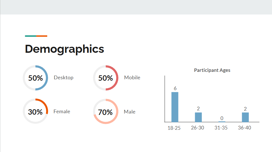
- A total of 20 users
- 10 desktop
- 10 mobile
- Demographics:
- 30% female
- 70% male
- Age Demographics:
- 18-25: 6
- 26-30: 2
- 31-35: 0
- 36-40: 2
Results
Insight #1
For this round of user testing, 70% of users clicked first to the product-based navigation, in direct contradiction to our analytics that suggested users preferred gender-based navigation.
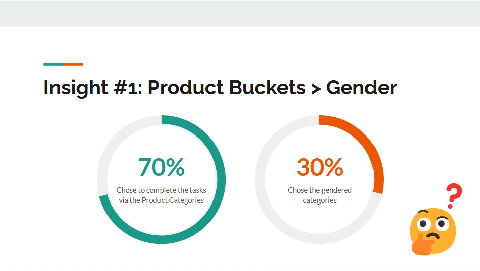
This was an unexpected result, to say the least. Fossil UX recommends adding participants to the existing test OR conduct a new test with more specific products for the users to find.
Outstanding Questions: Is this a real preference? A case of how users want to shop versus our menu navigation choices? Or just this batch of users?
Insight #2
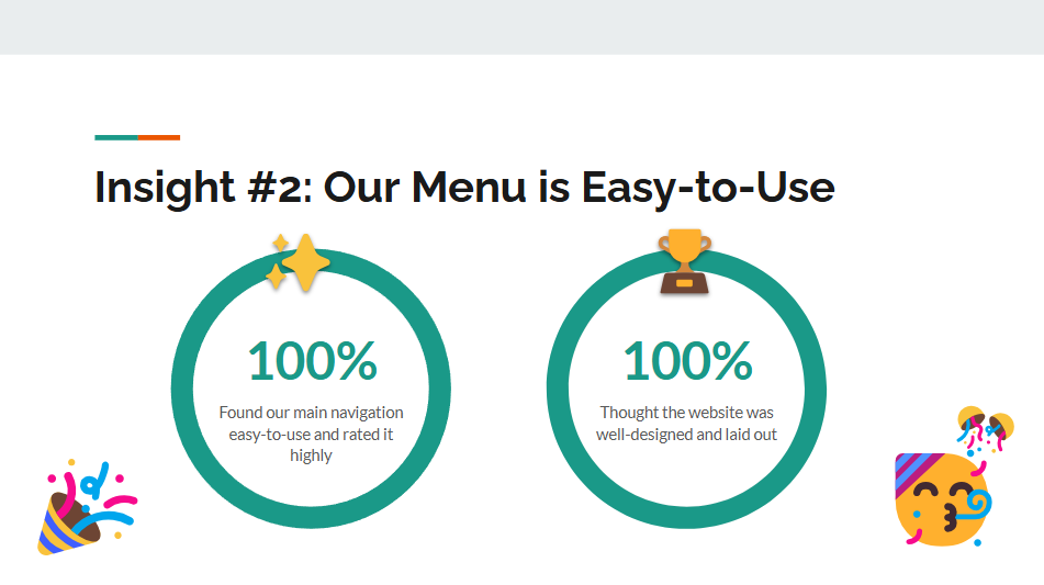
Users unanimously declared Fossil’s menu to be easy-to-use and commented that the felt the website was well-designed and laid out. Most users took only 14 to 18 seconds to complete each task, even with talking through their steps.
Overall, Fossil User Experience found no issues with the existing navigation and urged caution in implementing any kinds of novel navigation or confusing terms.
Second Round of Testing: Evaluate Proposed Changes
With this round of user testing, Fossil stakeholders moved forward with drafting their proposed changes. Stakeholder recommended a strictly product-centric navigation and a gender-focused navigation and submitted it for testing.
Since these changes did not exist on the Fossil website, a combined tree-test and first-click test were recommended to evaluate the information hierarchy and scope.
Methodology & Demographics
- Testing Tool: PlaybookUX
- Conducted: 07 Jan 2025
- A total of 80 users through two variants
- Demographics Provided by Analytics
- Gender: Female, Non-Binary
- Age: 25-50
- Household Income: $25,000 – $100,000 USD
- Country: United States, Canada, United Kingdom, France, Germany, Australia, India
- Language: English
Results
At first glance, participants seemed to find the product variant (3A) to be slightly easier to use, with a 77% total success rate.
The gender-based variant (2A) saw 72% total success rate, with more difficulties in finding less popular products such as sunglasses and other non-watch accessories.
The directness, a measure of the participants ability to locate the correct answer without backtracking, for both tests were around 60%.
Issues Encountered
In the first task, 60% of participants were unable to locate the target without extensive backtracking — if at all. In fact, the first task on both tests was unanimously strange, with participants choosing seemingly random locations with no correlation to the task. Subsequent tasks on both tests rose to a 90-98% success rate.
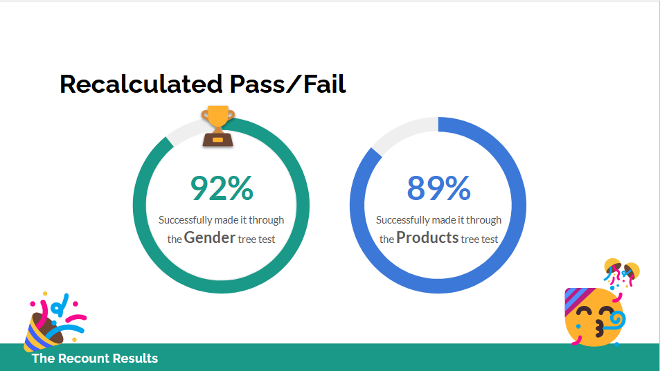
With the fear this result was skewing the test results, stakeholders requested a retest or a recount. With this in mind, the results were reviewed under the following guidelines:
- Pass: The participant completed the task as expected
- Indirect Pass: The participant needed to take extra steps, but ultimately reached the ask destination
- Close Enough: If the participant was on the website, they would have seen the expected product(s). This was also used to take cultural and local differences into account. (e.g. Satchels are a work bag in some regions)
- Fail: The participant did not reach the expected destination
This resulted in 92% of the users successfully completing the Gender tree test and 89% of users successfully completing the Product-focused tree test.