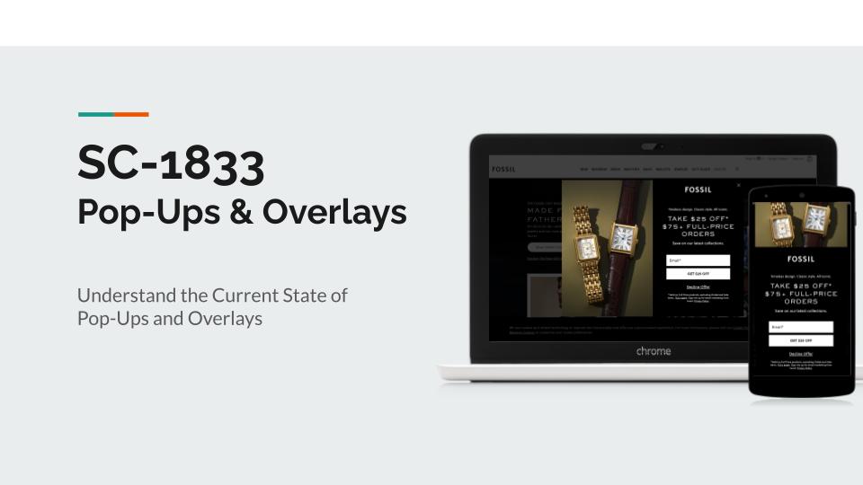
Description
Designed for:
Fossil
Platform:
Salesforce
Tools Used:
Google Slides
Ticket represents the first step in a new project to re-evaluate, re-structure, and re-launch a global pop-up strategy around all invasive elements of our site. While the scope of the project is being developed it will be influenced by the recommendations from the UX team’s research. Please include not just standard “pop-ups” but also anything that falls into the concept of intruding on the user’s path. This could be chat bot, feedback button, etc.
Scope
All sites, all regions.
Scope note: Please note that the roll out has the potential to be different per brand or even per region. We would like to understand holistically but please do provide guidance along these lines. If you feel it should be fully aligned then so be it but keep that in mind. (i.e. lux vs outlet vs fossil.com) If you feel we need to evaluate this across multiple stories please let Thane know and he can adjust.
Deliverables
- Research and recommendations based on current state across Fossil Group sites
- Full competitor analysis
- Score card comparison
- Best practice guidance to go from current state to better to best
- Recommendations for how you would like to capture success metrics (user interviews, surveys, etc.)
- Any other elements I may have missed that you feel are of value to this effort (first UX ticket, still learning)
Next Steps
While this is very much step 0.1 of this project a rough plan is understood to look roughly like:
- UX Research, Analysis, and Review
- Alignment across partners, internal and external technology teams, brand, and other digital stakeholders
- UI team involvement to help set Design System principle across our experiences
- Product team to structure technology test to match to UX and UI tests
- Develop and Test
- Develop and Launch
Each step should be considered a loop of learning and adjustments. This is not a delivery plan but an estimated path at this point in time for this project.
